CHALLENGE
A departure from headline metrics that don’t say enough – product and service owners need meaningful insights
Most government services are mandated to publish performance data on cost per transaction, user satisfaction, completion rate, and digital take-up. As a result, service teams often focus on these headline metrics—which, while important for accountability, are of limited practical use when it comes to diagnosing issues or improving the service. Product and service owners need sharper insight to understand whether a problem stems from a specific feature, a broken journey, or a sluggish tech stack.
As part of a wider effort to bring a new government service to life, I led the development of a first-of-its-kind performance framework—one that redefined how success is measured by integrating user experience, operational data, policy goals and technical performance into a single, actionable view.
APPROACH
Integrating user experience, operational data, policy goals and technical performance into a single, actionable view.
0. We know our NPS and monthly usage stats – why measure anything else?
(be melodramatic with me for a paragraph because this is something I care deeply about)
Here’s the thing: NPS and click counts won’t tell you why users are dropping off at step three, or how your service is failing the people it was meant to help. They won’t reveal that a policy is misunderstood, or that your backend process is quietly tanking performance. They won’t connect the dots that will show you how your customer support queries are linked to a missing user manual in your registration pack. And not only will they fail to tell you that—they’ll make you shell out a bunch of cash later to investigate what went wrong, when you could’ve caught the signals up front with the right feedback loops in place.
Measurement—real measurement—isn’t about vanity metrics or monthly reporting slides that die in unread inboxes. It’s about building better instincts across the team. It’s about spotting what’s working, what’s broken, and what’s quietly bleeding user trust in the background. Done right, it becomes your case for change, your early warning system, and your cheat code for delivering a good service. In government services this is critical because users rarely have the choice to opt out and find another service provider – they only have one option.
My first challenge was to get everyone to see that. This wasn’t about ticking a box to pass an assessment. It was about understanding the living, breathing organism we were responsible for—and learning how to keep it healthy. Intro my service design mind – time for a workshop.
1. “Is good for me, good for you?” & “What does good look like?”
We were supposed to be talking about improving the service and how to measure it meaningfully. But early conversations veered off-course—fractured across policy teams, back-office leads, and regulatory folks. The core tension? Whether we should track completions, policy outcomes or assess how well our guidance actually worked. (Spoiler: all three mattered.)
To cut through the noise, I introduced a level-zero service map—an end-to-end sketch of the journey that forced a shared perspective. Suddenly, stakeholders could see where their world intersected with someone else’s. The map wove in user needs, policy intent, and organisational goals—grounding the conversation in the lived reality of the service, not just departmental silos. And of course, it ensured success for users meant success for the service provider.
By the end of the session, we’d drafted a straw-man “service metrics dashboard,” built around three deceptively simple questions:
- What do you want to measure?
- How will you measure it?
- What will you do with the data?
That last one changed the game. It shifted measurement from a box-ticking exercise to a decision-making tool. And it got the team asking a better question altogether: What does good really look like—for users, and for us?

Fig.1 – Sample visual of the KPI workshops
3. Synthesis – Dashboard v1.0
The workshops surfaced a wide range of metrics, from user behavior to operational performance. We filtered and prioritised them based on two criteria: how valuable the insight would be, and how much effort it would take to get it. A clear pattern emerged: across the board, stakeholders wanted to know two things—Are we meeting the user needs we designed for? And is the service delivering on its goals?
That meant tracking things like:
- whether users were able to complete their tasks,
- what percentage of in-scope businesses had actually registered,
- how the service was performing technically (downtime, incident handling, etc.),
- how regulatory functions were being supported (e.g. volume and resolution of escalations),
- and whether the service was supporting broader policy ambitions like reducing carbon impact.
These needs broke down into four measurement blocks—user outcomes, service goals, operational performance, and policy alignment. Each had clear owners, and together they formed the backbone of the service’s measurement team.
Just as important was how we treated each metric: not as a number to collect, but as a decision-enabler. Each was reviewed with data analysts to test for feasibility, relevance, and purpose. For every measure, we mapped out what we were trying to learn, what success looked like, how it would be captured, and what actions it could inform—whether that was refining the policy, improving operational processes, or evolving the design.
Finally, we mapped it all against the service journey. What we built was a service measurement framework—one that didn’t just track progress, but helped everyone see how the service was performing as a whole, and how the UK was progressing on its commitment to clean up its supply chains from illegal forest-risk commodities
All cleaned up here:
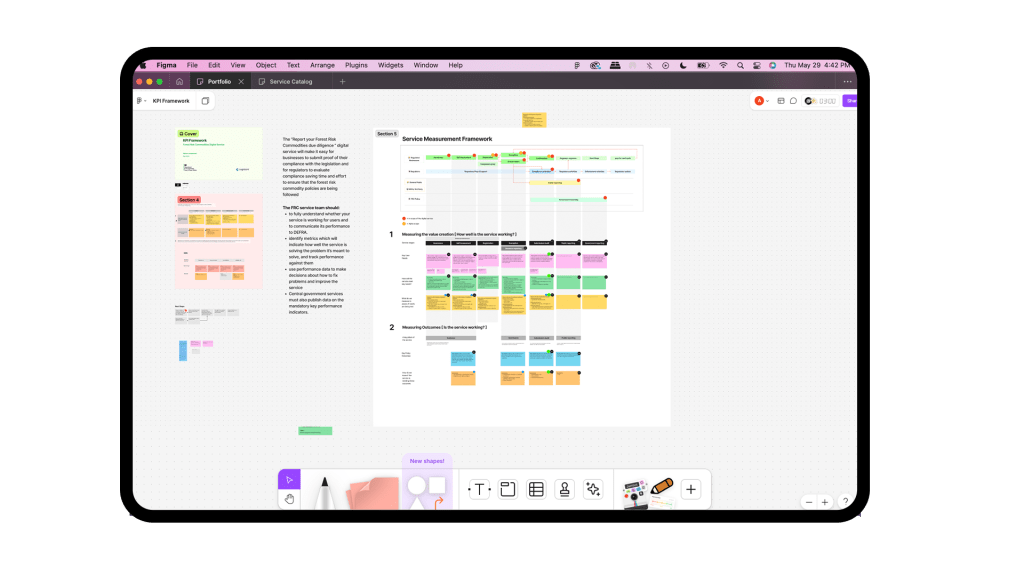
Fig.1 – Sample visual of the end to end service measurement framework
4. Getting Things Ready for Implementation
Once the framework was shaped, stress-tested, and refined, we took it through several rounds of sign-off with service owners and policy leads. (A quick note from the trenches: government teams are large, and decision-making moves at a tectonic pace—build that into your timelines.)
With the metrics agreed, I partnered with a data analyst to prototype a working dashboard in Excel. It wasn’t glamorous, but it worked—and more importantly, it made the whole thing feel real. The Excel version acted as a bridge: a clear, tangible artifact the implementation teams could pick up and start building from.
Because this was a brand-new service, we also had to define some of the baselines from scratch. That meant deciding what “normal” looked like for things like registration rates, guidance usage, or tech incidents. And yes—this was all done in alpha. Most teams don’t go this deep until beta. But I was lucky. I had a team that cared about building a robust, usable service from day one—and they gave me the space to lay the groundwork properly.
The Excel dashboard was signed off, too. That small act made a big difference. It gave data teams a clear path to follow and helped reduce friction later. To close out the phase, I developed a phased roadmap showing how the measurement framework would be embedded alongside the service’s design and delivery going forward.
The service is still in beta as I write this. But the groundwork’s there. The measurement thinking is baked in. And I can’t wait to see it out in the world—doing its job, and proving its worth.
IMPACT & OUTCOME
A shared vision of what performance measurement could enable.
📈
Decision-Backed by Data
Built real feedback loops with traceability—so every metric had a purpose, and every decision (from hiring to policy pivots) had evidence behind it.
✅
Alpha Passed with Praise
The service sailed through its GDS Alpha assessment, earning specific commendation from the CDDO panel for its robust, forward-thinking measurement approach.
💸
Costs Avoided, Not Just Counted
By capturing early signals and failure points, the team avoided future firefighting—saving time, budget, and the human cost of reactive service delivery.
🔁
Measurement as a Team Sport
Shifted measurement from a niche analytics task to a shared responsibility—giving designers, policymakers, and ops teams the tools to course-correct in real time.
